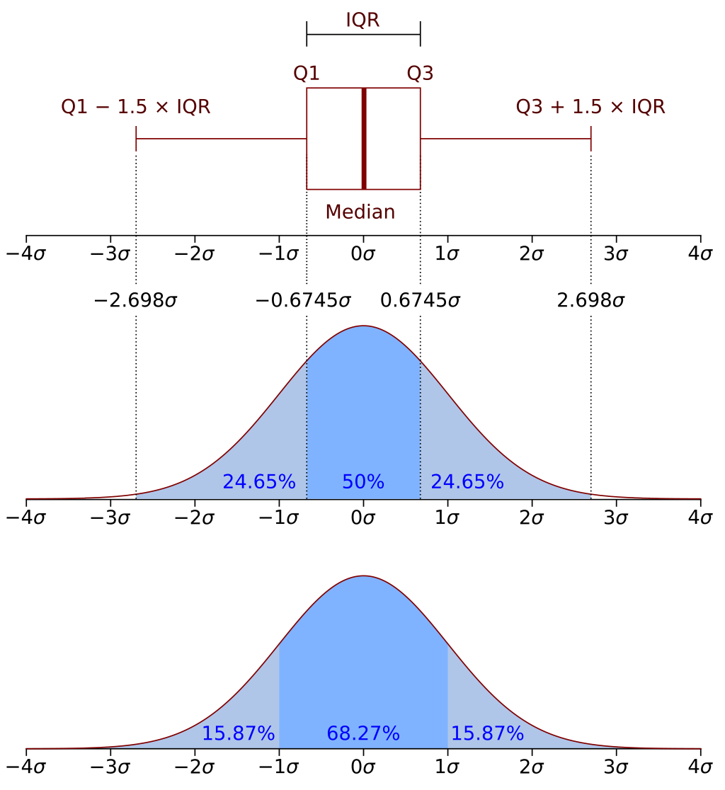
We have introduced additional charting, showing the distribution of returns for each sub-strategy. We present the distribution as a box-plot showing approximately the 2.7sigma distributions. The distribution of the data can be seen in the charts below. Box-plots with whiskers are an effective way of showing the distribution of the data. The axes are set to reflect the 10th to the 90th percentile of data. There are additional outliers.
The chart below is sourced from Wikipedia ( https://en.wikipedia.org/wiki/Box_plot)